“It's Time for Change...” | April Fools 2023
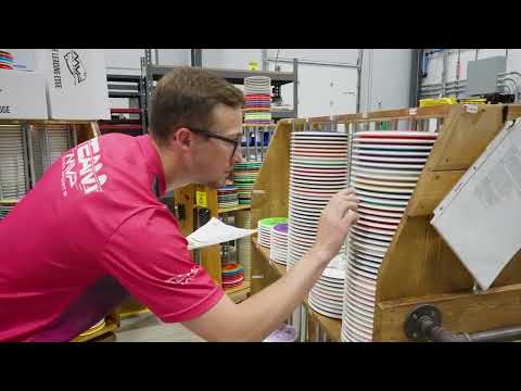
Watch as Mike Insco, Art Director at MEP Disc Sports, reveals how his team overhauled their brand logo in a bold move that's been years in the making. With a focus on symmetry, simplicity, and synergy, Mike and his junior designers Lee and another designer embarked on a 100-concept journey that ultimately led to a revolutionary new look. Drawing inspiration from art history and incorporating math, science, and energy, the RX Factor logo marks a significant shift for the brand. Through extensive experimentation and iteration, Mike's team perfected the design, striking a balance between modernity and timeless elegance. The result is a stunning logo that not only meets but exceeds expectations, cementing the brand's position in the market.
Top players face off in a hilarious April Fools' tournament featuring epic shots & surprising comebacks.
Watch on YouTubeVideo Transcript
my name is Mike insco I'm the art director at MEP disc Sports we've been thinking how do we change for the better how do we change for the audience of the modern world then we landed on the idea to change our long-standing logo my junior designers and Lee designer here on the project we went through countless iterations I would say months and months and months of different concepts it's just weren't up to par and we just realized that it's sitting right in front of us the entire time when you factor in the X's and O's of something as big as a brand logo change there's so many things to take into account you know symmetry Simplicity in our case science energy synergy so what Mike did in this situation for us is he made us realize that RX Factor was actually an o Mike is such a gifted designer people will see this logo and be at a loss for words the future it circles baby I worked extensively on this project did about 100 Concepts uh he scrapped every single one of them but now looking at his I I completely understand why he did that when I was approaching the design I was thinking more along the lines of the design we currently have but Mike completely did away with the name in general which I I wasn't thinking that direction so you know that's why Mike has the job he has if you think about it as a mark it dates back to the you know primitive days and the Renaissance Leonardo Donatello Raphael Michelangelo Pizza it's just complete it incorporates math science our history it resembles a beginning and an end the genre overmold it establishes our brand in the in the simplest form and that's that's exactly what we're after you know they thought Simon was our biggest thing in 2023 this is it foreign